Parallax Scroll Website
Description
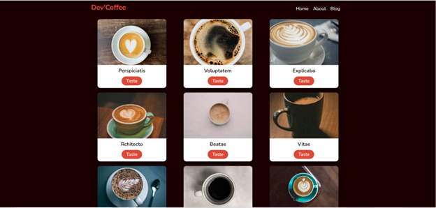
This webpage is an example of a parallax scroll website. It seemed a little plain
so I added an animated h1 title to the header, where I included a Hero image. I also
added a Google map for the end slide.
Parallax Scroll Website
Reflection Statement
I have previous experience reading about parallax scroll websites but I have little
knowledge about completing one. It was not as hard as I though it would be. I had a
hard time trying to resize the map and making it responsive. I had the most issues with
making the navigation responsive for mobile. I tried at least 5 different templates but I
still was unable to get it the way I wanted. I still want to learn how to make a responsive
navigation with a logo. I did learn to be a problem-solver by researching how to fix the
issues I had with the navigation and map.
Resources
Animate.css
Maps.ie
W3cschools.com: How to create a parallax scrolling effect.
W3cschools.com: How to create a hero image.
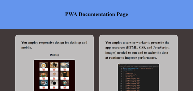
Parallax Scroll Website Documentation
Innovation and Expansion of Skills
This webpage is an example of a parallax scroll website. With a parallax scroll website, you just
add background images, that's why I included the hero also. Adding a reponsive header with a menu and
a logo was challenging, since I do not use an unordered list for my navigation: I think it adds extra
CSS when I can just use a link tag. The navigation did push my limits because it I wanted it to look a
certain way versus how it looks in the tutorial. I always change any tutorial I complete to make it
unique to what I want and try to challenge myself. The CSS for the Google map gave me some issues but I
went through the CSS line by line until I was satisfied with the results.
added a Google map for the end slide.
Web Coding and Design Standards
I used the Chrome browser to view and work with the project. For validation, I used the w3.org
Nu HTML Checker and the W3C CSS validation service. I did receive errors for the iframe but that
is the only way to include the Google map. I used HTML semantic tags in the website, along with
image alt, and meta tag data. My website is SEO optimized for page titles, meta tags, body text,
headings, images, internal links, and navigation. The colors are balanced, practical, and aesthetic.
The website is also mobile responsive.