Bottom Up Design Project Challenge
Description
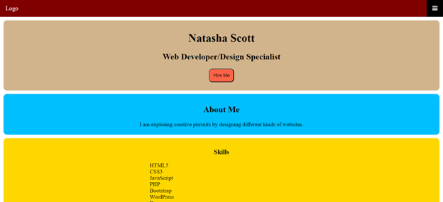
In this challenge, I had to create a homepage with the mobile first concept. The homepage targets a smartphone with no code for tablets or desktops.
Bottom Up Challenge
Reflection Statement
Before this lesson plan, I only coded one mobile first website. It was a clothing website for a tutorial that I completed. It included Bootstrap as a framework. In this learning plan, I increased my knowledge of designing mobile first. I still need more practice on coding websites with mobile first layouts.
CSS Media Query Project
Description
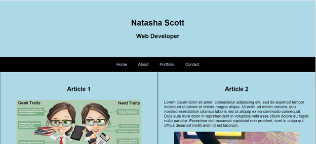
This is a web page using a grid view layout. The web page is supposed to be 100% responsive on desktops, tablets, and mobile phones.
Media Queries Project
Reflection Statement
Prior to this learning plan, I have not used the grid view layout. I prefer not using floats for my website layouts. I still need to practice floats. I have used media queries on numerous websites so I am very familiar with them. This website was my first time using media queries for orientation. This lesson plan was a review for me. I could use more practice using media queries and clearing floats.