You employ adaptive images.
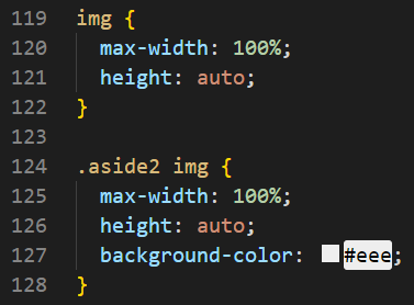
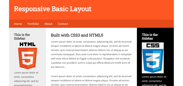
I added images to the main and both sidebars. I gave them a max width of 100% and a height of auto.
I added images to the main and both sidebars. I gave them a max width of 100% and a height of auto.
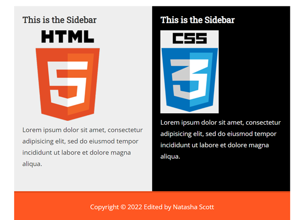
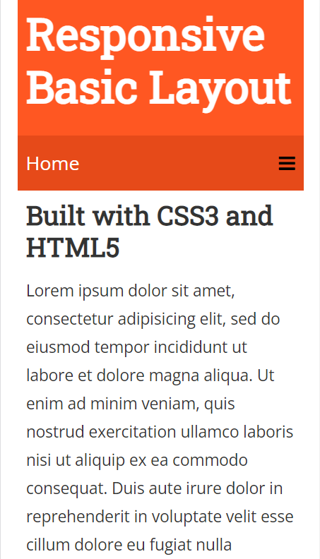
I changed the layout so the two sidebars would be beside each other under the main area.
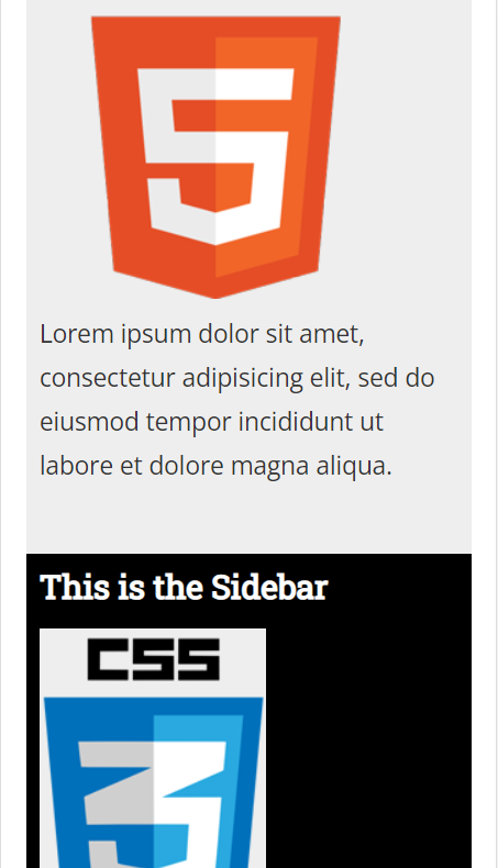
I changed the layout so that the two sidebars are following the main area.
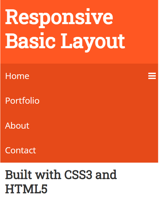
I did not change the navigation for the tablet because it was still sufficient. For the mobile view, I added the mobile navigation menu.
The navigation is at least 300px x 60px. I did this so the navigation would be easy to click.
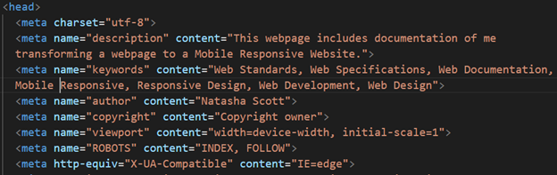
I optimized my page titles, added meta tag descriptions and keywords. I used headings, alt tags with all my images, and my navigation titles.
I optimized my page titles, added meta tag descriptions and keywords. I used headings, alt tags with all my images, and my navigation titles.